Today we had our first sprint review. It consisted of a meeting with the client and a meeting with the teachers. First we had the meeting with the client and they were very enthusiastic and afterwards we had the meeting with the teachers and we got a lot of feedback from them.
Kees made notes during the meeting with the client, which you can read at the bottom of this article (first document is my translation of the notes, second is the original). The conclusion was that the client really liked it, but we did notice that they had some expectations that might not be possible like a giant world with all the clothing they have in it (this will consume too much time for us), so next meeting we will talk to them about it and explain what we can do.
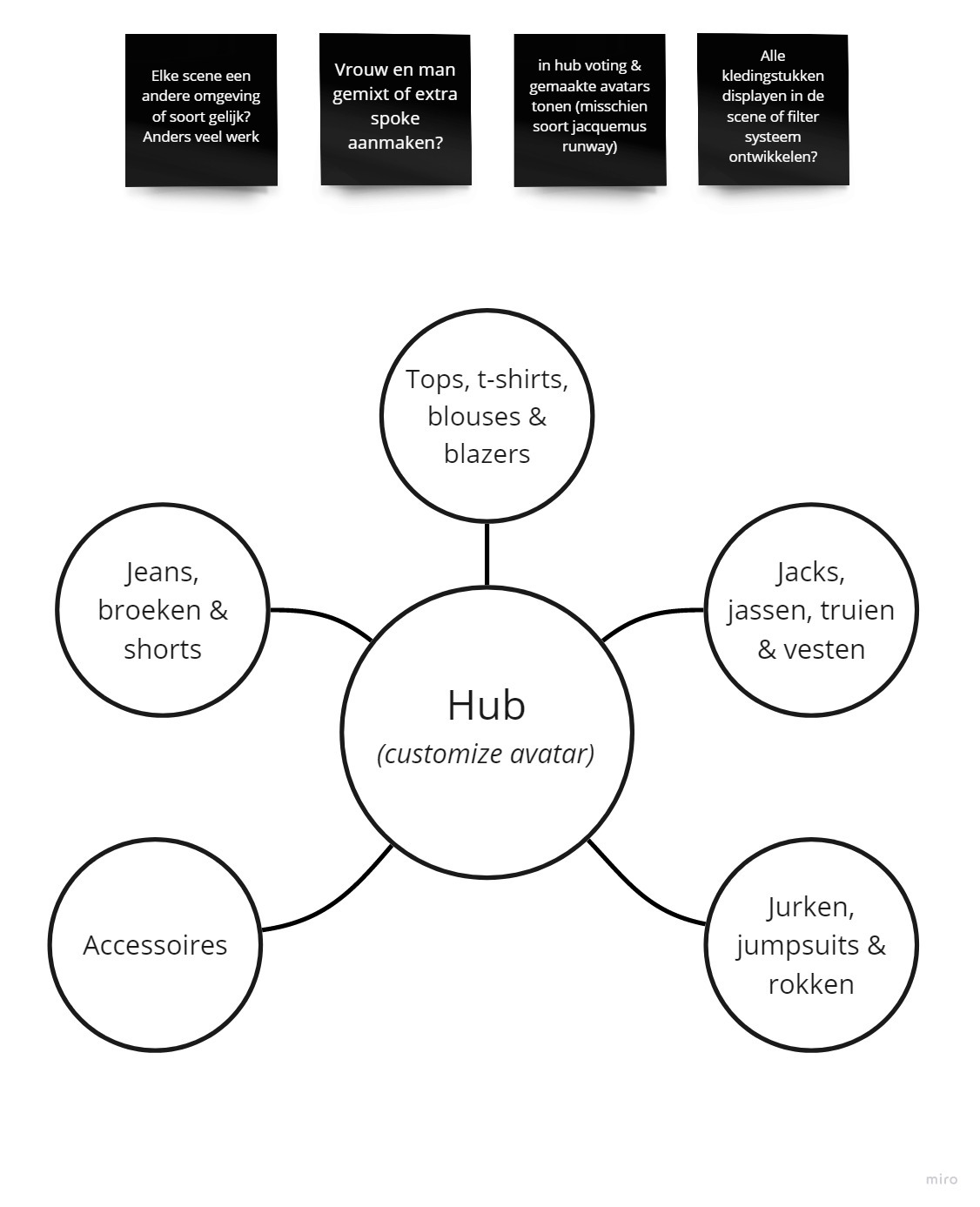
We have already thought of a solution for the size of the world which also solves the need for teleportation (which we discovered while testing was not a good idea). This solution was an idea from the teachers in the second meeting, they proposed a hub-and-spoke system where we could divide the clothing types between different hubs and have one main hub where you dress and edit you character. Ebru has designed this and you can see her model here:

Another tip from the teachers was that we should refrain from using the terrain tool in Unity because it creates a lot of unnecessary polygons.
Another big thing the teachers noted is that it was confusing to dress an avatar that is only in first person and that we need to find a way to have the player view their avatar. I agree with them because we would have needed to make an extensive work around to make it work well in first person and being able to see yourself at all times.
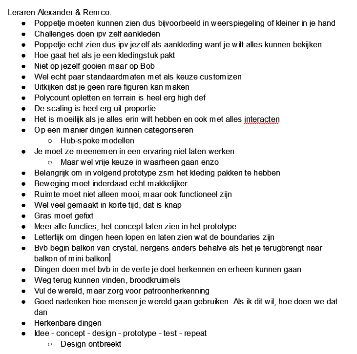
We also made some notes of the teachers meeting (English version below image):

– You must be able to see the puppet, for example in a reflection or smaller in your hand.
– Do challenges instead of dressing up yourself
– Really see the doll instead of using yourself as a decoration because you want to be able to see everything
– How does it go when you pick up a piece of clothing?
– Don’t throw it on yourself but on Bob
– Really some standard sizes with as choice customizing
– Watch out that you can not make weird figures
– Polycount and terrain is very high def
– The scaling is very out of proportion
– It is difficult if you want to have everything in it and also interact with everything
– One way to categorize things
– Hub-spoke models
– You have to take them into an experience not make them work
– But you do have free choice in where to go and so on
– Important to have the clothing system in the next prototype as soon as possible.
– Movement should indeed be easier
– Space should not only be beautiful, but also functional
– A lot has been made in a short time, that is clever
– Grass needs to be fixed
– More all functions, show the concept in the prototype
– Literally walk around things and show what the boundaries are
– E.g. start balcony of crystal, nowhere else except when it brings you back to balcony or mini balcony
– Doing things like recognizing your goal in the distance and being able to go there
– Find your way back, breadcrumbs
– Fill the world, but make sure you recognize patterns
– Think carefully about how people will use your world. If I want this, how do we do it?
– Recognizable things
– Idea – concept – design – prototype – test – repeat
– Design is missing