Concepting & Design
Introduction
My goal for concepting and design was learning about concepting and designing a product from beginning to end. I want to learn things like designing areas in the game (which I did together with Ebru) and designing things like the Shoe-bee.
Changes since last feedback round
I did not change anything since the last feedback round, because I did not get feedback on this during that session.
Conclusion and reflection
I reached my goals for this as you can see in this chapter I did a lot with it (for instance the bush carousel design), but I do think I could have learned more, this is more so because this wasn’t a defined learning goal for a long time and I did not ask enough from teachers to help me more with this. In a next project I plan to ask an expert to give me tips in advance.
Redesign to make removing teleportation possible
Ebru and I had a conversation about how to design the world so that we did not need teleportation anymore. We did this because we want to use controllers and for this it would be easier for the end user if they do not have to teleport and they do not have to use a lot of buttons. We discussed how we could make the world so that the user can reach everything and they only need to walk a maximum of two meters in real life.
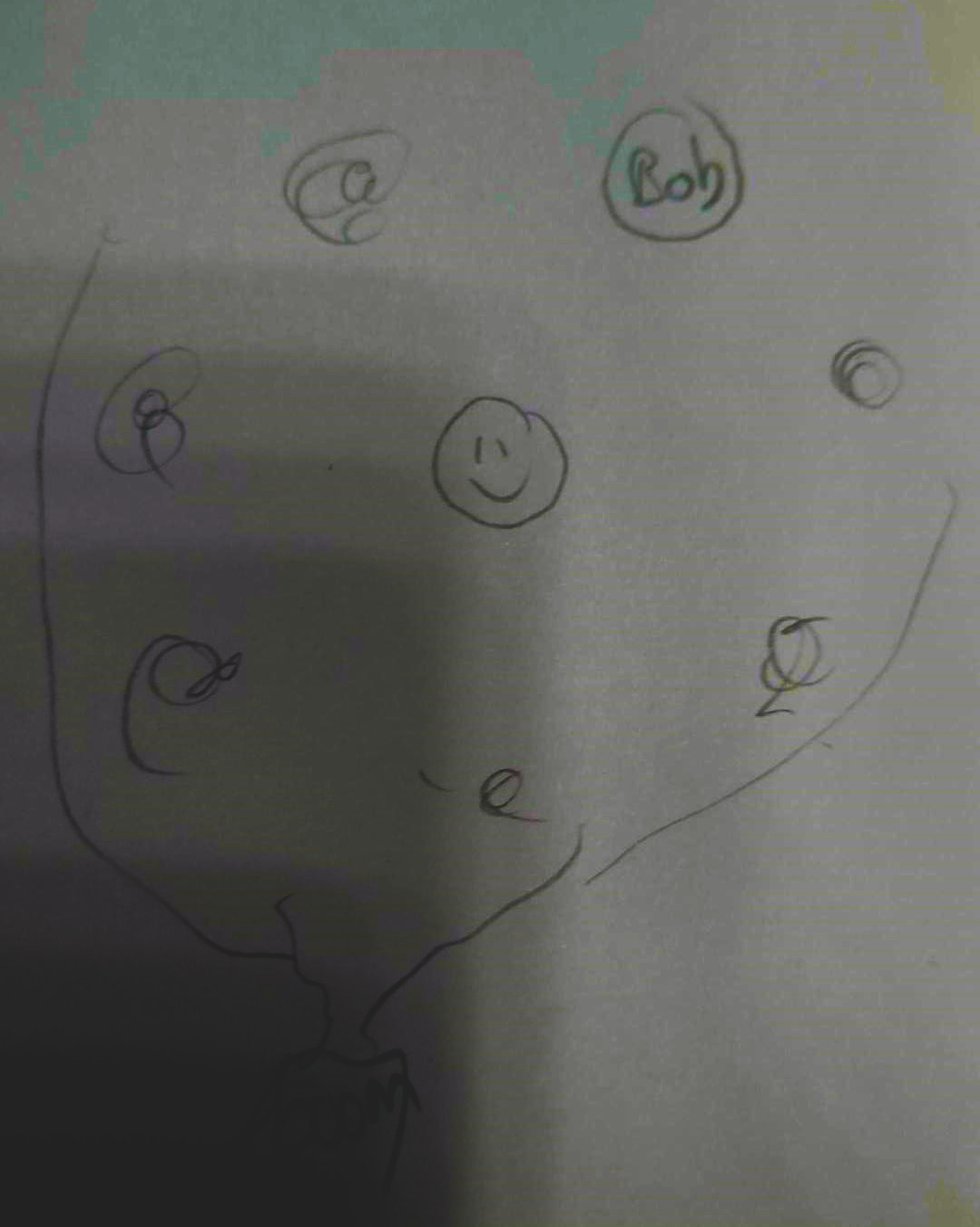
For this we wanted it so that the bushes are really close to the player and that the avatar is equally as close. I drew my idea from top-down perspective and send it to Ebru. First I had the idea that the tree could be a bit more angled and create a roof with it above the play area. That’s why I drew the second picture. I discussed this with Ebru, but she said the tree would not look good anymore if we did that and I agree with her, because you would have to make the tree too not-natural for that. That is when I thought that the tree could still create shadow over the play area. This gives some warmth in the game.
I also thought that we could put the avatar between the bushes, so that it is the same distance from the player as everything else. This way the player has a better overview and can easier throw things at the character.
Next we talked about how we could display the clothing. For this I came up with a carousel above each bush. This way the user can swipe through multiple options and see everything quickly. There can be an infinite number of clothing pieces in the carousel but the user will only see five at once (the clothing pieces fade in and out at the back). You can read about the implementation here. The user will also only see the carousel when the bush is in focus. Otherwise they will only see one piece that describes the carousels category. This is better for the performance and it is better for the user because we do not want to overwhelm them.
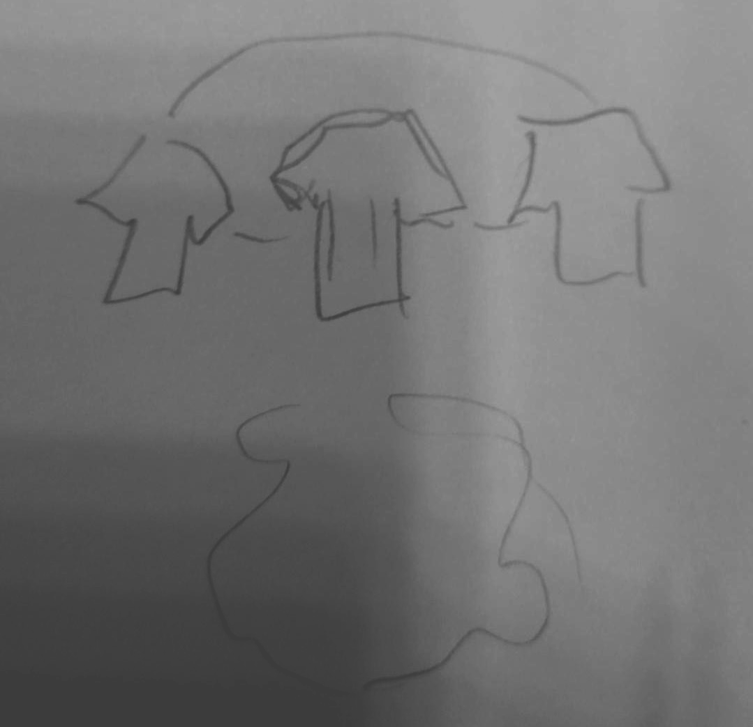
Front view 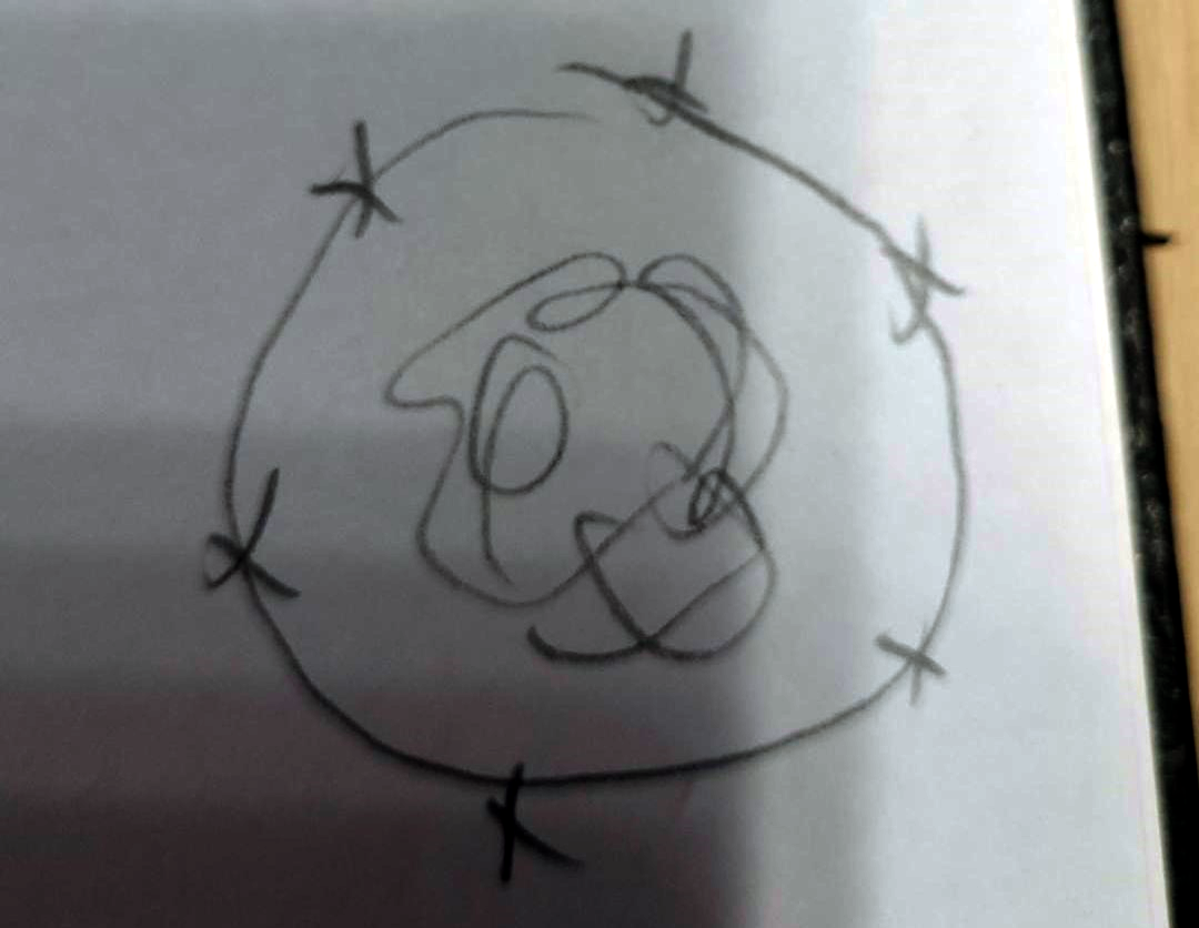
Top-down view
Reflection
What I learned from this is that it is easier to convey your ideas with short sketches and that sometimes it is better to only talk with one other person at a time, because then you can hop through ideas quicker. I also learned that it is possible to remove teleportation even if you want the user to interact with multiple things.
Clothing rack idea
Today I did some programming for the project while the others continued on the game flow designing. But I did help them with some ideas. For example how to make a sort of shopping basket.
We want the user to be able to put clothing aside they like so they can later use that to dress their avatar or look closer to it. Thinking about the tree we have as a centre piece of the environment I came with the idea to replace the shopping basket with a big tree branch you can hang clothing on. Everyone loved this idea. I will update this article when it is implemented with screenshots. NOG DOEN.
Development of the Shoeby concept
During the project our concept changed a lot so I am writing this article to show what has changed from the beginning.
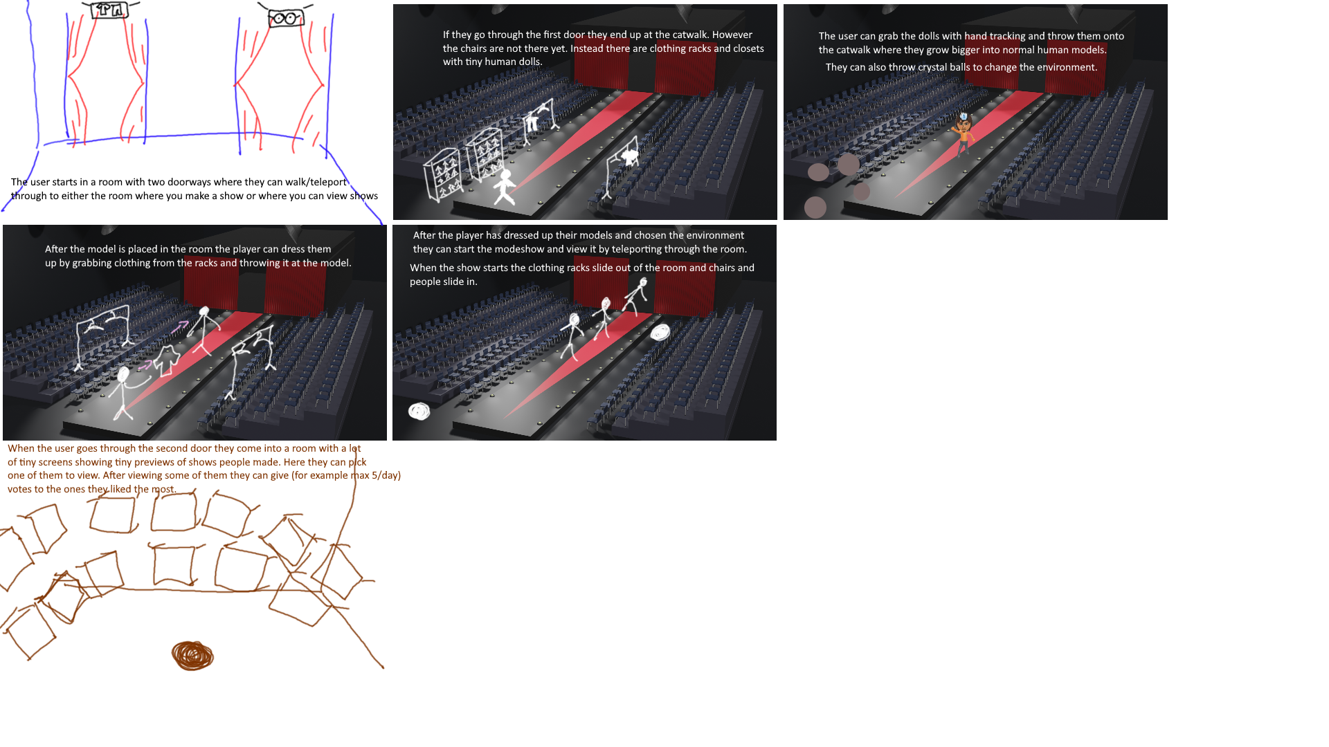
Our first concept has two parts. In the first part (also the first room) you can make your own fashion show with a variety of models and clothing. You can also change the set and so on. You grab a tiny character from a closet and throw it on the runway where it grows into a real life size. You dress the character by throwing clothing to them. The second part (and second room) is where you can view the fashion shows of other people and give them votes. You can also view this concept in the storyboard here.
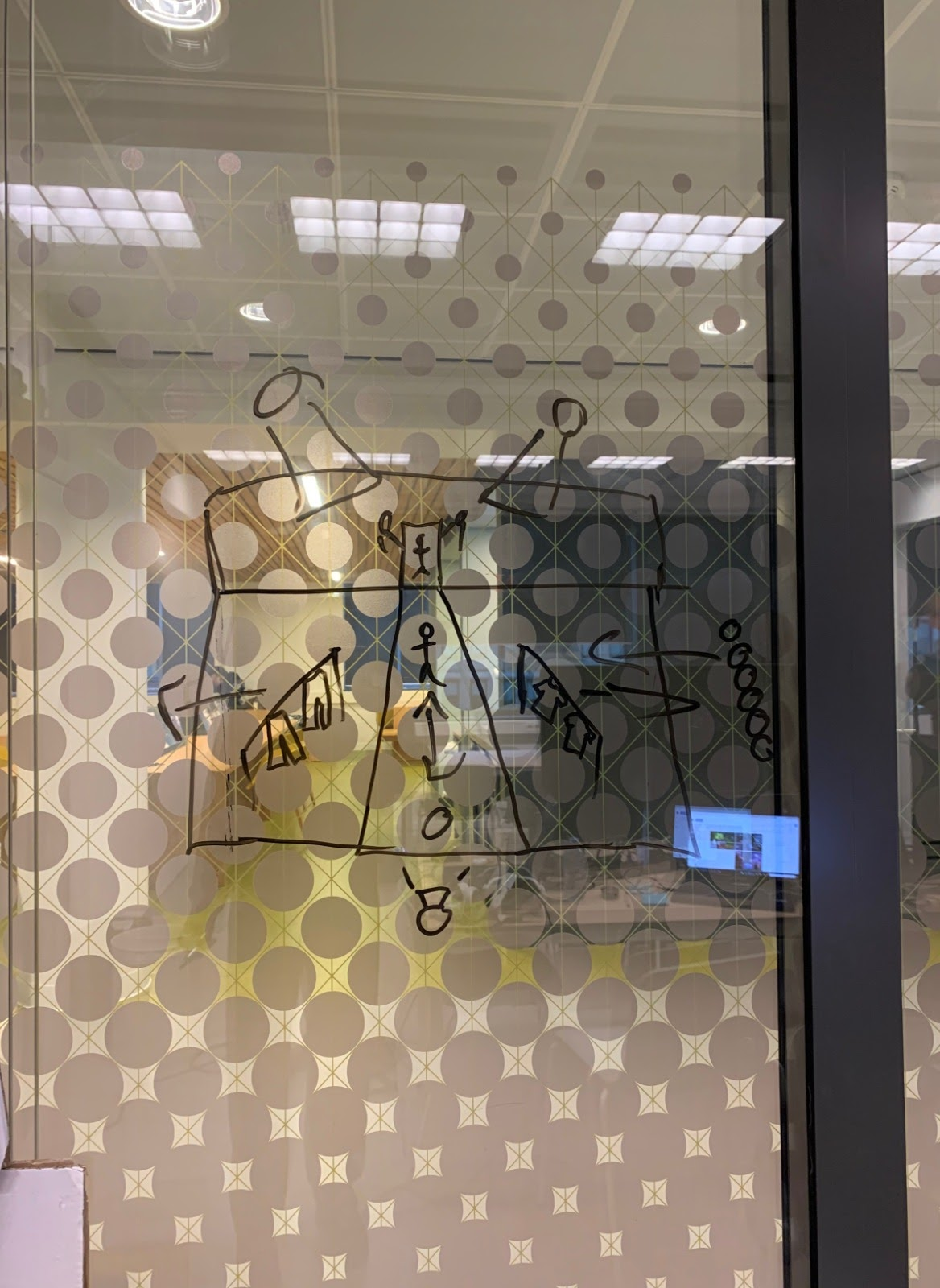
Our next concept was a big nature area with three parts. One where you can customize your character, the second to dress your character and the third where you can make pictures of your character. In the whole area there are avatars from other people walking around and you can vote on them by doing a thumbs up.
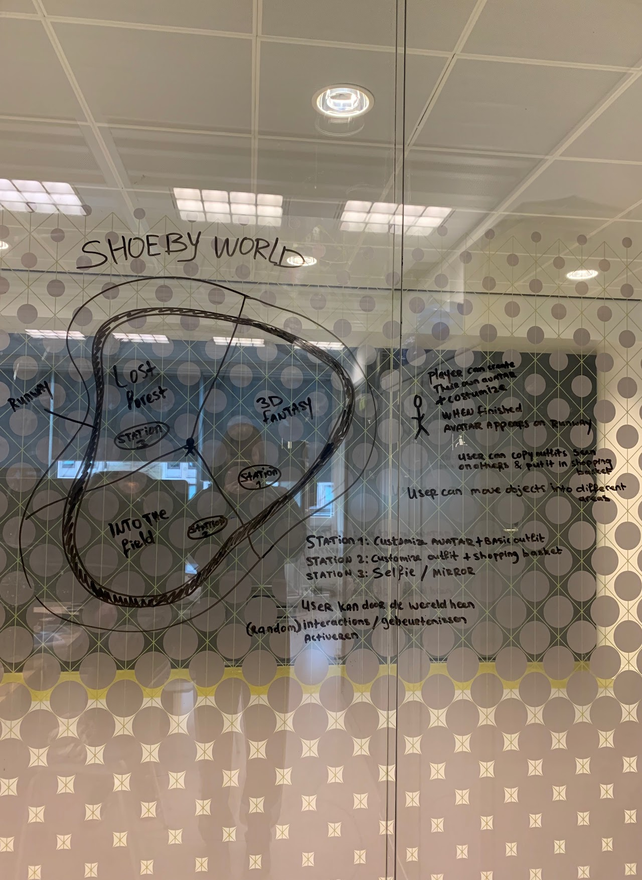
Our latest and current concept consist of a few hubs which you can see here. These hubs all contain a clothing category and you can travel to the hubs by using a map on which you can point to a hub and then you teleport to it. This concept also has the Shoe-Bee which helps you when you are stuck and it also contains the settings like sound for the game. From the hubs you can grab clothing you like and throw them onto your character or put them into your shopping basket. In the main hub you can style and customize your avatar. There is also a runway here with models from other users. You can view the storyboard here.
Designing the Shoe-bee
For the game we want to have a character that can help the player when needed. This is for instance when they do not know what to do or if they want to change a setting. For this I am making the Shoe-bee.
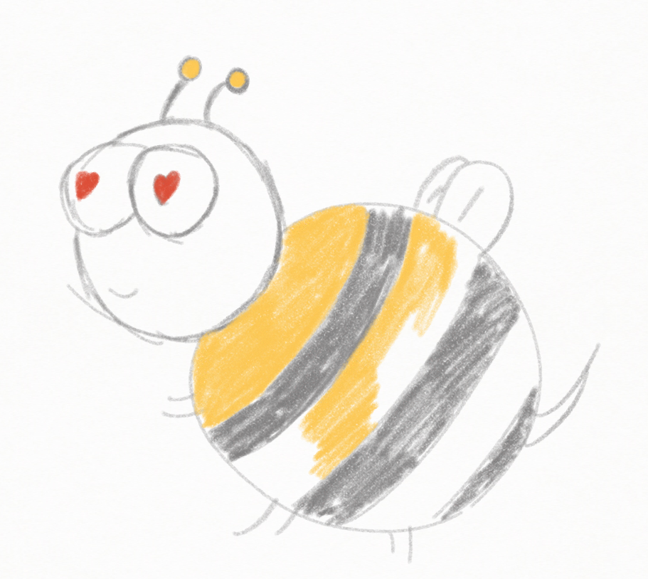
I began by starting to sketch a simple cartoon bee (picture 1), but I realised that it did not fit with the Shoeby brand. In our conversation with the client about the Shoe-bee they said that they loved the idea, but it had to be a fashionable bee. I kept this in mind while making my second “sketch” (picture 2). I showed the finished drawing to my teammates and they liked it.
The only thing that I will need to reconsider during modelling the bee is the thickness of its legs. This was feedback from Scott. This will be something that I will test during modelling to see what looks good. I will be modelling the bee in Medium by Adobe on the Oculus Quest 2, because one of my learning goals is trying out 3D-modelling in VR. You can see the article about trying out Medium here. After and during the modelling I will also focus on the design of the bee’s presence in the game. Where it is flying and how the player will interact with it for example.
Sketch 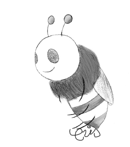
Design
Storyboard
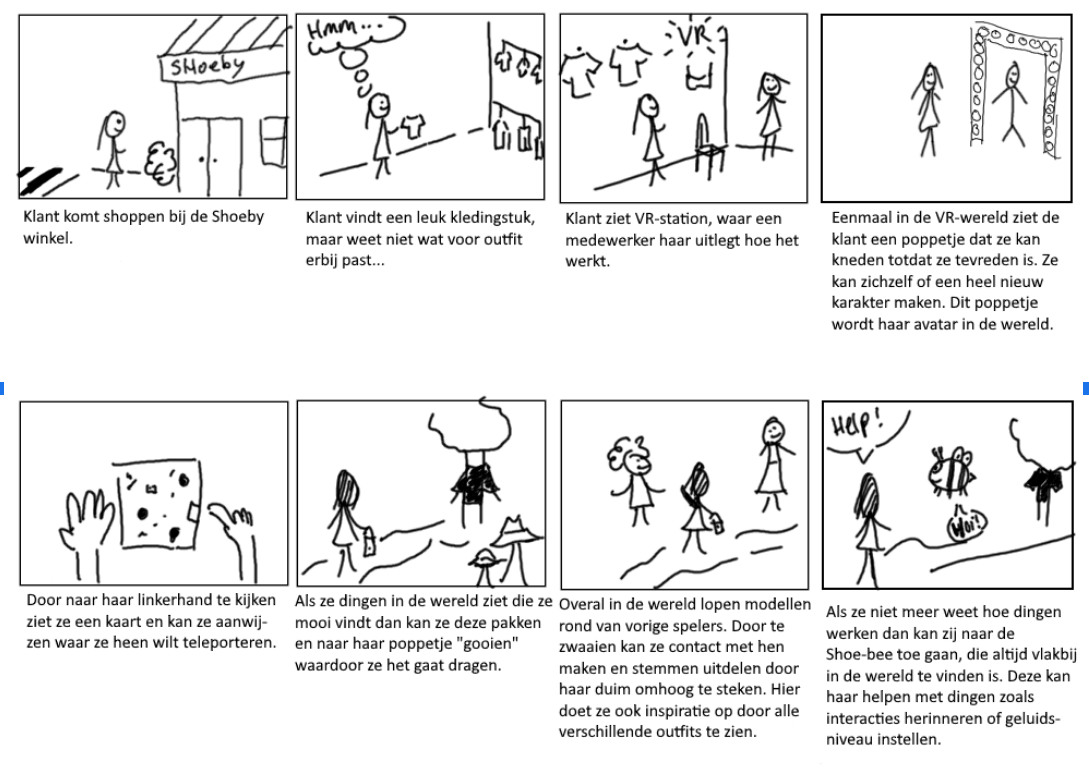
Before we had the sprint review presentation for the client I made a new storyboard, so we could convey the current idea better.
I made the storyboard by thinking step by step from the beginning where a normal Shoeby customer would go shopping. This is because the transition from a normal shopping experience to the VR experience is also important for our concept, because the VR experience is meant to enhance the normal shopping experience. I also focussed on the core idea for the storyboard, without drawing to many pictures I tried to get the most important parts of the concept explained.
The board also helped explain the flow within the experience to the client better and during the presentation we noticed it really helped them to understand the concept better. Without a step by step (preferably with pictures) explanation of the concept we had a hard time explaining and we learned that it is a good idea to start with the storyboard next time (we did not do that this time and I noticed it did not help with clarity).
We also used this storyboard to test the new ideas of the map and the Shoe-bee and they were well received by the client. It helped to incorporate them in this storyboard, because it helped us get our thoughts together and helped the client understand their purpose.
Experimenting with modelling in VR
Today I spent the morning experimenting with the program called Medium by Adobe. It is an Oculus app where you can make models by manipulating a mass.
I tried to make a couple of things to try out and when I did not feel it was getting anywhere I just started a new model, because that is how I like to experiment (my own experience is that I get better results by restarting instead of trying to make something work that is not going to work). I tried making an anime character, a video game character and a Pokémon.
I can unfortunately not show the models because they are still in the VR headset, but I can describe my process.
I first just tried out what all the tools did and what I liked to work with. Then when I discovered you can load pictures, I loaded some pictures to have references. I also discovered that you can resize a model while working on it, but there is a catch: the sharpness does not scale, so I had a lot of trouble because I wanted to add small details but it ended up looking blocky because there were not enough polygons available at that scale. Next time I work with the program I will try to start by making the smaller details first and then making the larger parts. I hope this will help with the problem I described.
First Storyboard
For our design document we wanted to have a storyboard but we did not have one yet. This meant that it was harder to explain our concept to other people.
I made the following storyboard so that we had a better and visual summary for our concept. However the concept has changed a lot since this storyboard, so I made a new one a bit later. You can see the new one here.
This old concept had two rooms: one where you can dress up characters and make a fashion show and another where you could view other peoples fashion shows.
Concepts for companies
In the first week with our group we had presentations of the companies and about what they wanted to be solved with VR. Then we came up with concepts with our group and presented them to the companies at the end of the week.
InSpark
How can InSpark use the Holosuite in combination with the HoloLens 2 to position InSpark and optimally inspire the possibilities of Mixed Reality/Microsoft?
InSpark
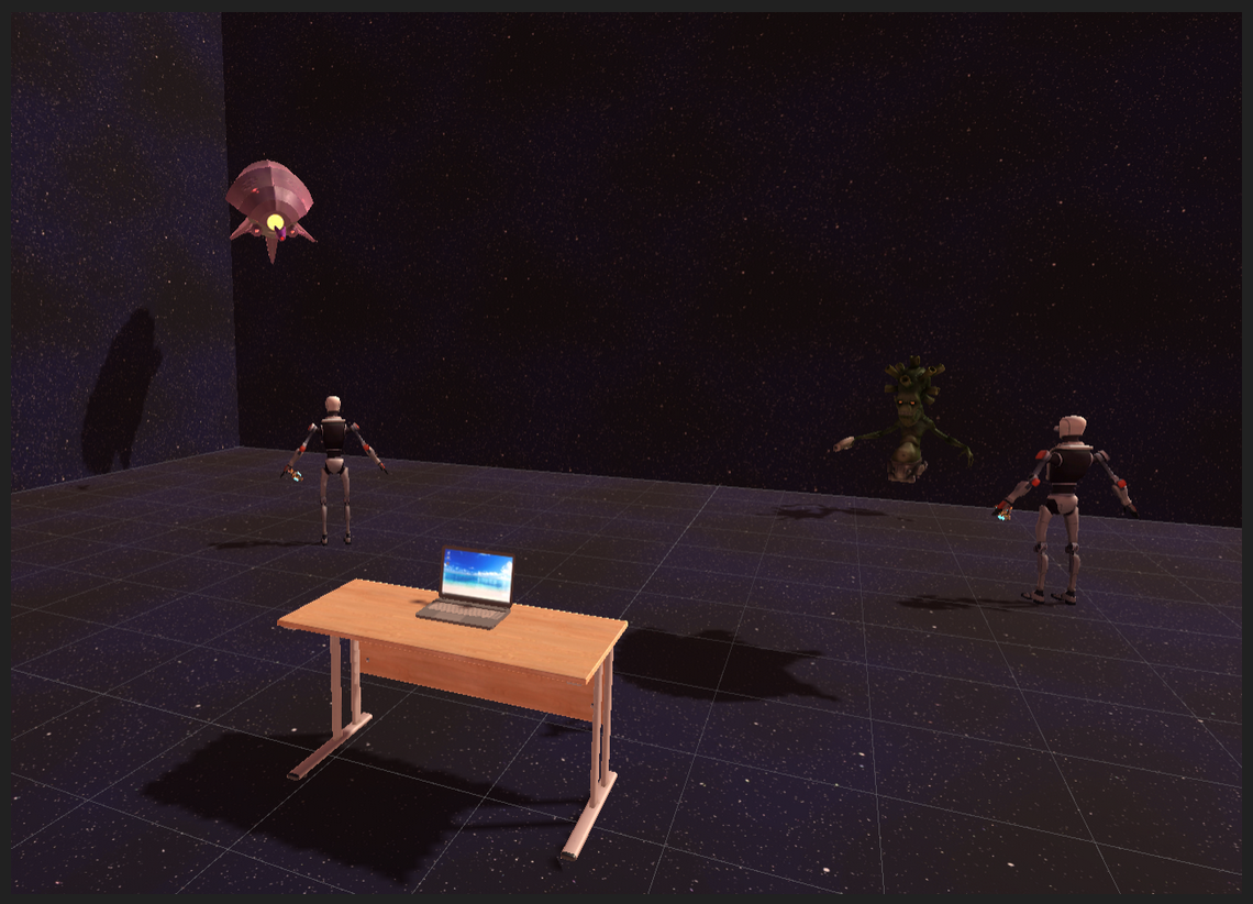
After we listened to the presentation of InSpark I had trouble understanding what they wanted us to do, this was because they did not have a specific problem like the other companies. This is way we had an extra conversation with them after the presentation and they told us that they wanted something cool to show to potential customer and that cool thing had to be something that shows of the HoloSuite that they have. The HoloSuite is a room filled with screens that works together with the HoloLens (mixed reality glasses from Microsoft). With this in mind I came up with the following idea: a game where one player fights against a team. The solo player has control over the HoloSuite and can make monsters come out of the screen and the team wears HoloLenses and fights those monsters. The players can all be different classes to promote working together and to make it more fun, for instance healer, fighter, etc.
Fashion Research and Technology Group
How do we build persistent and synchronous interactive worlds?
How do we make them intuitive and enable citizens to influence the world and intertwine it with the physical world we are living in?
And how does the metaverse affect our sense of belonging?
Fashion Research and Technology Group
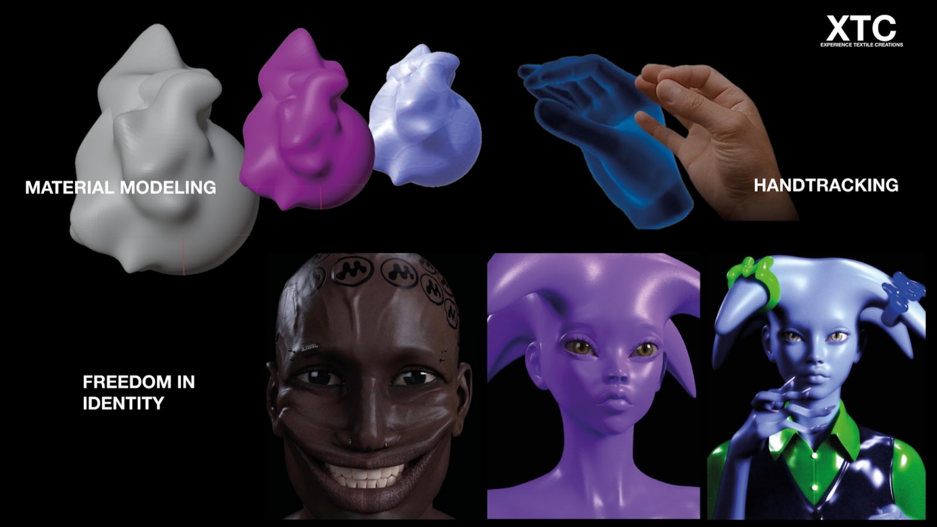
This was really the hardest problem for us, because it was really out of the box and we had a hard time understanding what was asked of us. Eventually we came to the conclusion that they wanted us to make something new that goes further than how to normal world works (in combination with fashion).
The concept we made was very broad. It was a world where people can manipulate materials in a way you cannot do in the real world. For example changing the material of the skin from your avatar to cardboard. The concept had a big undertone of “freedom in identity”, because we wanted people to have the freedom to create a world and be creative in a way that is not possible in real life. We noticed while presenting that the company representative immediately got more ideas from hearing our concept.
Gemeente Amsterdam
How can you ensure that IV and CTO become more aware of our preconceptions and so become socially more diverse and inclusive?
Gemeente Amsterdam
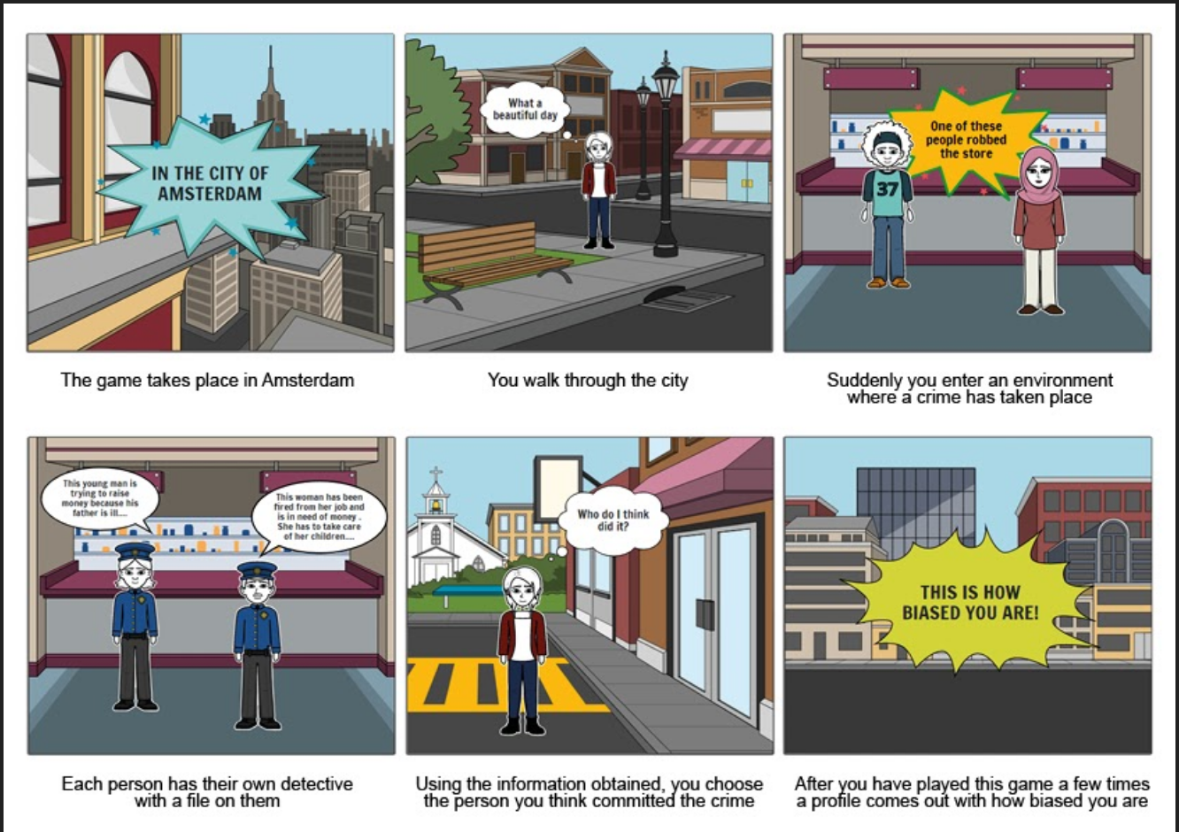
For this company Jules quicly had an amazing idea. The concept was about walking through Amsterdam and then finding small crimes which have to be solved. Two detectives both tell you who they think is the criminal and then you have to decide which one of them did it. The idea behind the game is that sometimes you get to pick between two people who are for instance from two different ethnicities. The game then looks at those instances and provides a rapport at the end of the experience so that there can be a discussion about what they experienced.
Shoeby
How can we use VR within the physical shop floor to create an enhanced shopping experience for the customer? Keeping in mind that the core value of Shoeby is personal and close by.
Shoeby
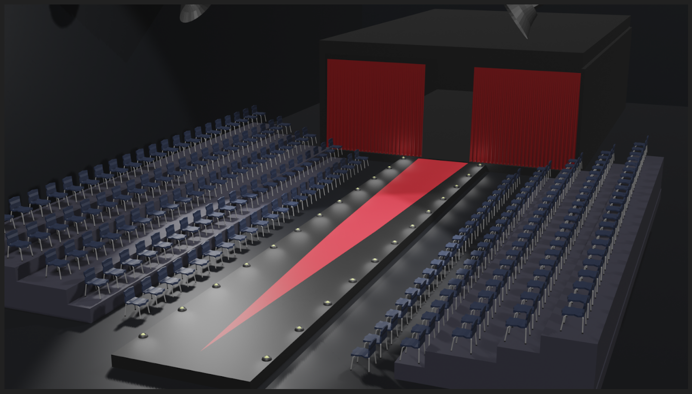
We found it the hardest to come up with a specific idea that for Shoeby. We did have a general idea, where we wanted to have some sort of dress-up element in the game but we kind of shifted between multiple variations. We also wanted it to feel special, because we didn’t want to make “just another” dress-up game. Our first concept was a couple of minigames, where for instance every headset in the store could have a different minigame. We talked to the teachers about this concept and they came with an interesting and true remark: minigames may be small to play, but they take the same amount of time to develop as a single large game. After this we started brainstorming again and Scott said that maybe we should do the idea I said before. My idea was making some sort of a runway game where people can dress-up models who walk on different kinds of runways. Our goal with the application is inspiring people with new outfit ideas. People can share their fashion shows and other people can view them when they visit the VR experience in the store.
SpecialistenNet
How can VR/AR contribute to the prevention of psychological complaints?
SpecialistenNet
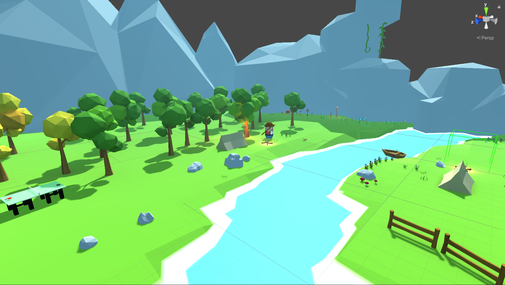
SpecialistenNet wanted us to come up with an application that helps people prevent getting psychological complaints and also spot if a person has a chance to develop such complaints. We wanted it to be a relaxing experience without putting the focus on psychological things, because we did not want to trigger people and we wanted to make them feel relaxed so that they have less chance to develop psychological complaints. After some research we thought about making something in nature, because nature is relaxing and research has proven that nature is good for your mental health. We also thought about doing things with AR/MR but we did not go through with that, because we wanted to get the people playing out of their office (since the game would be provided at office work places).
Our concept was about doing pleasant activities in nature together with a buddy. You have you own world where you can do various things like playing ping-pong, painting or catching bugs. You will also get linked to someone in your company from a different department and with a different personality. This way you can have someone new to meet and you can also talk with this person about things that are on your mind.
At the end of the day Shoeby picked us as their favourite and we are now working for them to realise the above idea. We actually refined the idea even further, which you can read in this article. This is the presentation we made for the companies:
