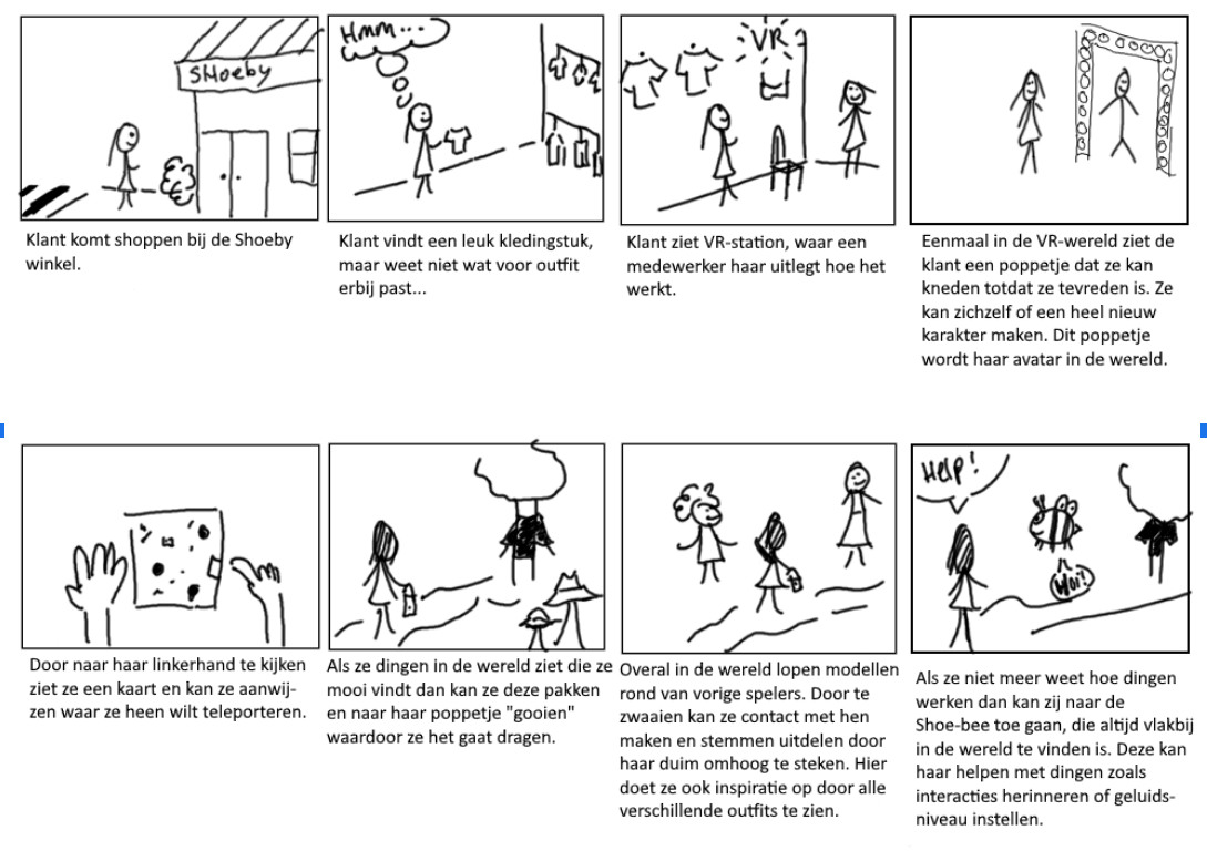
Before we had the sprint review presentation for the client I made a new storyboard, so we could convey the current idea better.
I made the storyboard by thinking step by step from the beginning where a normal Shoeby customer would go shopping. This is because the transition from a normal shopping experience to the VR experience is also important for our concept, because the VR experience is meant to enhance the normal shopping experience. I also focussed on the core idea for the storyboard, without drawing to many pictures I tried to get the most important parts of the concept explained.
The board also helped explain the flow within the experience to the client better and during the presentation we noticed it really helped them to understand the concept better. Without a step by step (preferably with pictures) explanation of the concept we had a hard time explaining and we learned that it is a good idea to start with the storyboard next time (we did not do that this time and I noticed it did not help with clarity).
We also used this storyboard to test the new ideas of the map and the Shoe-bee and they were well received by the client. It helped to incorporate them in this storyboard, because it helped us get our thoughts together and helped the client understand their purpose.
